One-Page vs Multi-Page Portfolio Websites: The Difference?
Choosing the right structure for your portfolio is just as important as choosing the design itself. One of the most common questions creators face is whether a one-page or multi-page layout works better.
This one page vs multi page portfolio decision affects how visitors experience your work, how long they stay, and how clearly your skills are communicated. There is no universal answer—but there is a right choice for your goals.
WHAT IS A ONE-PAGE PORTFOLIO WEBSITE?
A one-page portfolio presents everything on a single scrolling page. Sections like introduction, projects, skills, and contact information are stacked vertically and revealed as users scroll.
This structure works especially well for personal portfolios that focus on storytelling. Visitors get a complete overview without needing to navigate between pages, which creates a smooth, guided experience.
WHAT IS A MULTI-PAGE PORTFOLIO WEBSITE?
A multi-page portfolio separates content into individual pages. Projects, about sections, and contact details each live on their own page, allowing more room for detail and organization.
This approach works well when you have a large body of work or need to explain complex projects. It gives visitors the freedom to explore specific sections without scrolling through everything.
HOW STRUCTURE AFFECTS A 3D PORTFOLIO WEBSITE
In a 3D portfolio website, structure plays an even bigger role. Motion, depth, and interaction need space to breathe. One-page layouts often feel more immersive, while multi-page layouts offer better control for complex animations.
The best modern portfolios don’t overload every section with effects. Instead, they use interaction selectively to guide attention and support the overall flow.
WHEN A ONE-PAGE PORTFOLIO WORKS BEST
One-page portfolios are ideal if you want to keep things focused. They work well for students, content creators, and professionals who want to highlight a small number of strong projects.
This format pairs naturally with minimal layouts and subtle interaction. It’s often the easiest way to create a strong first impression without overwhelming visitors.
WHEN A MULTI-PAGE PORTFOLIO MAKES MORE SENSE
Multi-page portfolios are better suited for professionals with diverse projects or detailed case studies. Developers, designers, and agencies often benefit from the extra space and clearer separation.
This structure allows visitors to explore at their own pace and dive deeper into individual projects without distractions.
SINGLE PAGE VS MULTI PAGE: HOW USERS ACTUALLY EXPERIENCE IT
A single page site creates a focused experience. Visitors scroll once and see the full story unfold in a clear, linear flow. This makes single page design especially effective when the goal is to guide attention without interruption.
In a personal portfolio website, this approach often feels more intentional. Instead of clicking through multiple pages, users stay engaged as each section naturally leads to the next. When designed well, the experience feels smooth and cohesive.
A one page 3D portfolio website takes this a step further by using depth and motion to reinforce flow. Subtle transitions, layered sections, and controlled interaction help maintain interest without overwhelming the visitor.
WHERE MULTI PAGE DESIGNS SHINE

Multi page designs offer more flexibility when content grows. Each section can exist independently, making it easier to organize complex projects, detailed case studies, or different service areas.
This structure works well when visitors want to explore selectively rather than follow a fixed path. Multi page layouts allow users to jump directly to what matters most to them, which can be useful for larger portfolios.
The key difference is intent. Single page sites prioritize guided storytelling, while multi page designs prioritize flexibility and depth. Neither is better by default—the right choice depends on how you want your portfolio to be experienced.
CONTENT DEPTH VS CONTENT FOCUS
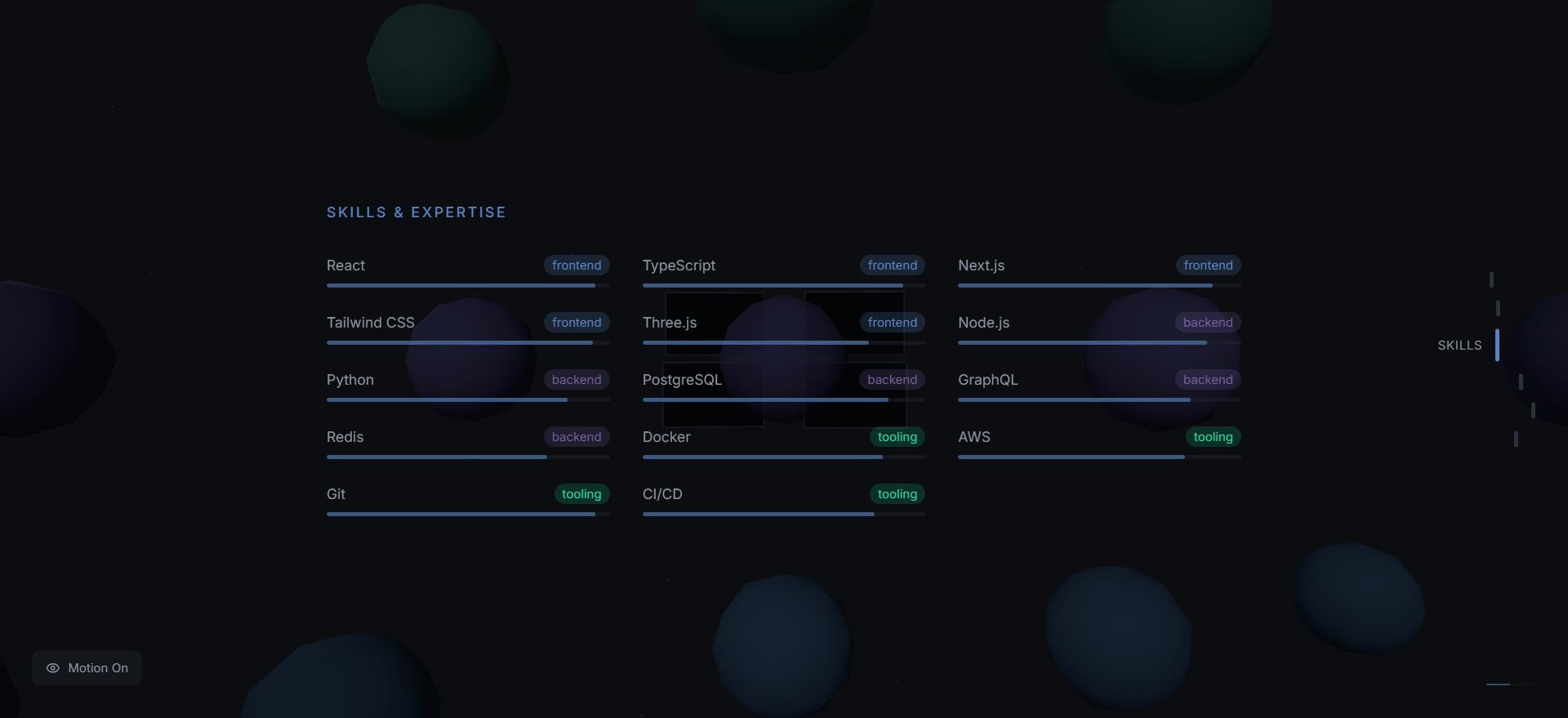
One of the biggest differences between one-page and multi-page portfolios is how content is presented. One-page layouts naturally encourage focus. You choose a small number of strong projects and guide visitors through them in a deliberate order.
This approach works well when the goal is clarity over quantity. Instead of overwhelming visitors with everything you have ever built, you highlight only the work that best represents your current skills and direction.
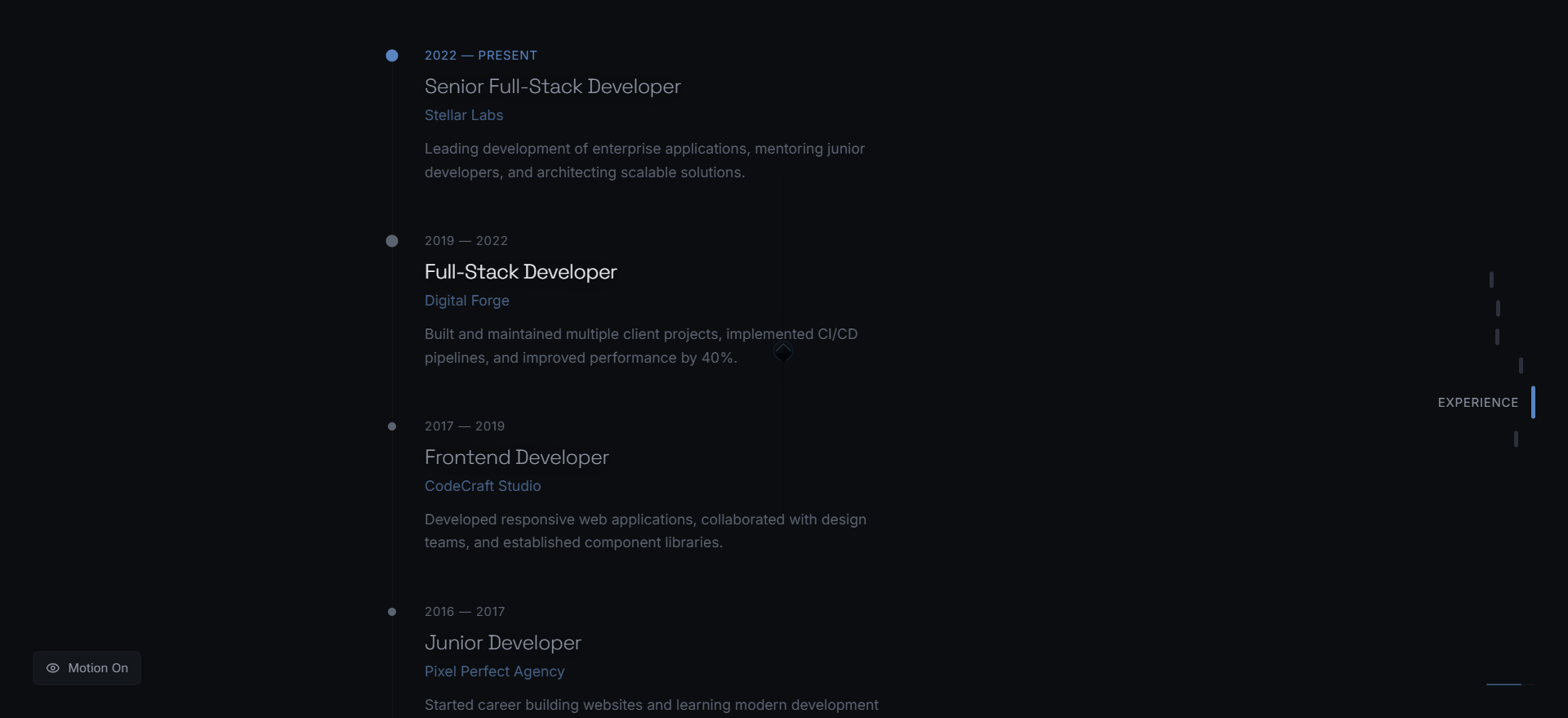
Multi-page portfolios, on the other hand, support depth. They allow you to expand on individual projects, include detailed case studies, and separate different types of work without crowding a single page.
HOW RECRUITERS AND CLIENTS SCAN PORTFOLIOS
Most visitors do not read portfolios line by line. They scan. Structure plays a major role in how quickly someone understands your value. One-page portfolios tend to perform well when visitors want a fast, high-level view.
Multi-page portfolios work better when visitors are already interested and want to explore deeper. Clear navigation and well-labeled sections make it easier to jump directly to specific projects or skills.
Understanding how your audience scans content can help you choose the right structure. If most visitors are discovering you for the first time, simplicity often wins. If they are evaluating you seriously, depth becomes more valuable.
FUTURE-PROOFING YOUR PORTFOLIO
Another factor to consider is how your portfolio will evolve. One-page portfolios are easier to maintain early on, but they can become crowded as your body of work grows.
Multi-page structures offer more flexibility for long-term growth. New projects, experiments, or sections can be added without disrupting the existing layout, making them easier to scale over time.
Choosing the right structure today can save you time later. The best portfolios are not rebuilt every year—they evolve gradually as your work and experience expand.
PERFORMANCE AND USER EXPERIENCE
Performance matters regardless of structure. A well-built one-page site can feel fast and fluid, while a poorly optimized multi-page site can feel slow and fragmented.
The key is intentional design. Choose the structure that supports your content, not the one that feels trend-driven.
HOW THIS FITS INTO MODERN PORTFOLIO DESIGN
Today’s portfolios focus on clarity, flow, and purpose. Whether one-page or multi-page, the strongest portfolios guide visitors naturally and remove unnecessary friction.
If you’re exploring how modern portfolios use interaction and layout to stand out, this guide covers the broader design principles in detail.
Read the Complete Guide to Modern 3D Portfolio WebsitesDevelopers interested in how technology influences structure can also explore how React-based portfolios approach interaction and layout.
Learn When to Use React for 3D PortfoliosTHE BOTTOM LINE
The one page vs multi page portfolio debate doesn’t have a universal winner. The right choice depends on your goals, your content, and how you want visitors to experience your work.
Choose the structure that helps you communicate clearly. When structure aligns with intent, your portfolio feels natural, focused, and memorable.